Space Tourism Multi-Page Website
Frontend Mentor Challenge
Repository: https://github.com/toonchavez8/10_Space_Tourism_Multi-Page_Site
Project Overview
This project is my implementation of the Space Tourism Multi-Page Website challenge from Frontend Mentor. The challenge focuses on translating a professional UI/UX design into a fully responsive, multi-page frontend experience while adhering closely to provided design specifications.
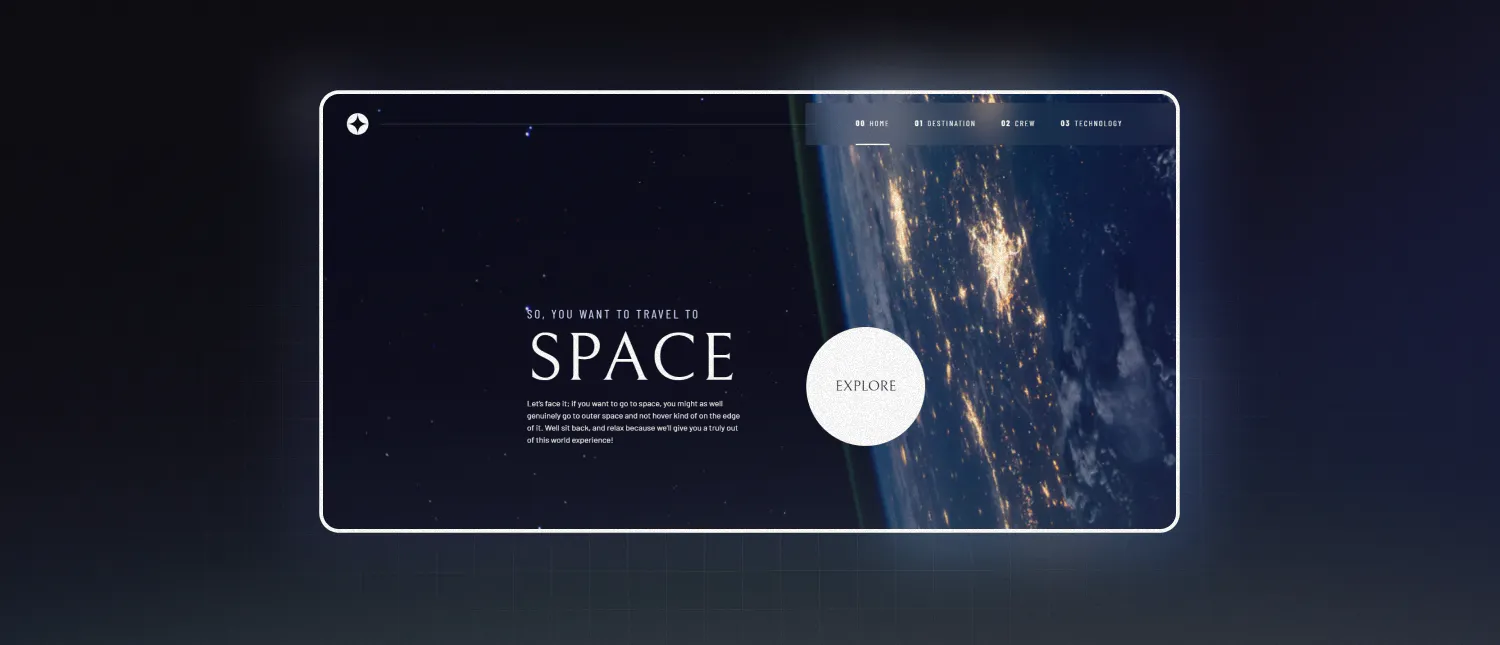
The website presents a fictional space tourism company and includes multiple sections such as Home, Destination, Crew, and Technology. Each section introduces unique layout challenges, interactive elements, and responsive behaviors across screen sizes.
Goals of the Challenge
The primary objectives of this challenge were:
- Build a fully responsive multi-page website from provided designs
- Match layout, spacing, and typography as closely as possible
- Implement interactive tab-based content using JavaScript
- Ensure hover and focus states are present for all interactive elements
- Maintain accessibility and semantic HTML structure
This challenge mirrors real-world frontend work by providing design files, assets, and strict visual requirements.
Tech Stack
- HTML5 for semantic structure
- CSS3 with Flexbox and Grid for layout and responsiveness
- Vanilla JavaScript for interactivity and state changes
No frontend frameworks were used, allowing a strong focus on fundamentals and browser-native APIs.
Key Implementation Details
Multi-Page Architecture
Each section of the site was structured as its own page, connected through a shared navigation system. This approach reinforces best practices around layout reuse, consistency, and navigation state handling.
Dynamic Tabbed Content
Several sections (such as Destination, Crew, and Technology) rely on tab-based navigation to swap visible content without reloading the page. JavaScript is used to control active states and content visibility.
Example logic used to handle tab interaction:
const tabs = document.querySelectorAll('[data-tab]');
const panels = document.querySelectorAll('[data-panel]');

tabs.forEach(tab => {
  tab.addEventListener('click', () => {
    tabs.forEach(t => t.classList.remove('active'));
    panels.forEach(p => p.classList.remove('active'));

    tab.classList.add('active');
    document
      .querySelector(`#${tab.dataset.tab}`)
      .classList.add('active');
  });
});
This approach keeps the UI responsive while maintaining clean separation between structure, style, and behavior.
Responsive Images and Layouts
The design required different image assets for mobile, tablet, and desktop views. Responsive image techniques and media queries were used to ensure the correct assets are loaded at the right breakpoint.
<picture>
  <source media="(min-width: 1024px)" srcset="image-desktop.jpg">
  <source media="(min-width: 768px)" srcset="image-tablet.jpg">
  <img src="image-mobile.jpg" alt="Destination image">
</picture>
This ensures performance optimization and visual consistency across devices.
Layout Precision with CSS Grid and Flexbox
CSS Grid was used for larger page structures, while Flexbox handled alignment and spacing of smaller UI elements. This combination made it easier to adapt layouts between screen sizes while preserving the design intent.
Hover and focus states were carefully styled to meet the interaction requirements of the challenge:
nav a:hover,
nav a:focus {
  border-bottom: 2px solid var(--accent-color);
}
Responsive Design Approach
The site was built with a mobile-first mindset. Media queries progressively enhance the layout for tablet and desktop screens, ensuring usability and clarity at every breakpoint.
What I Learned
Through this project, I strengthened my understanding of:
- Translating professional designs into production-ready frontend code
- Managing interactive UI state with vanilla JavaScript
- Building responsive, multi-page layouts without frameworks
- Structuring maintainable CSS for complex designs
- Paying attention to detail in spacing, typography, and interaction states